PA, S/R, ZL, EXTREMES & MOMO
Moderator: moderators
-
1992 DREAM TEAM
- rank: <50 posts

- Posts: 32
- Joined: Sat Jan 01, 2011 7:52 pm
- Reputation: 0
- Gender:

Please add www.kreslik.com to your ad blocker white list.
Thank you for your support.
Thank you for your support.
-
PebbleTrader

- rank: 1000+ posts

- Posts: 1633
- Joined: Fri Nov 12, 2010 2:15 am
- Reputation: 15
- Gender:

"This is called the box size. It may be 1 point, or it may even be 50 points. No matter what value is assigned, you may not plot an X or 0 until the price has reached the next interval. For example, if each X and 0 is 50 points, then the values of ascending XS would be 50, 100, 1 50, 200 and so on. A price move from 50 to 99 would be ignored because it had not reached 100. It is important to note that the[highlight=red] 'box' [/highlight]represents the price and not the line. Point and Figure charts are plotted differently from line or bar charts. With line or bar charts the price scale is represented by lines, so a price of 100 is on the horizontal line at 100. With Point and Figure charts however, 100 is a square with an X or an 0 above the 100 line." - The Definitive Guide To PnF
Last edited by PebbleTrader on Wed Sep 14, 2011 5:29 am, edited 1 time in total.
Life is just a journey
-
PebbleTrader
- rank: 1000+ posts
- Posts: 1633
- Joined: Fri Nov 12, 2010 2:15 am
- Reputation: 15
- Gender:
I am respectfully retracting my 1st & 2nd trys at graphing MO's example and will be resubmitting my answer. This is my final answer and I'm locking it in:
http://i55.tinypic.com/qp4itz.jpg
http://i55.tinypic.com/qp4itz.jpg
Life is just a journey
-
PebbleTrader
- rank: 1000+ posts
- Posts: 1633
- Joined: Fri Nov 12, 2010 2:15 am
- Reputation: 15
- Gender:
What I was doing before was:
------ .8830
|```` |
------ .8820
(incorrect)
Vs.
------
|```` | .8830
------
------
|```` | .8820
------
(correct)
The graph paper "box" should be a value, not the upper and lower LINES of a box.
------ .8830
|```` |
------ .8820
(incorrect)
Vs.
------
|```` | .8830
------
------
|```` | .8820
------
(correct)
The graph paper "box" should be a value, not the upper and lower LINES of a box.
Last edited by PebbleTrader on Wed Sep 14, 2011 5:36 am, edited 1 time in total.
Life is just a journey
-
PebbleTrader
- rank: 1000+ posts
- Posts: 1633
- Joined: Fri Nov 12, 2010 2:15 am
- Reputation: 15
- Gender:


Please add www.kreslik.com to your ad blocker white list.
Thank you for your support.
Thank you for your support.
-
PebbleTrader
- rank: 1000+ posts
- Posts: 1633
- Joined: Fri Nov 12, 2010 2:15 am
- Reputation: 15
- Gender:
"Because no time is involved in their construction, the chart can show one thing only:[highlight=red] uncontaminated supply and demand. [/highlight]  Uncontaminated, because the chart is not showing anything else - no time, no volume, nothing else which may distort the true interaction of the demand from buyers or supply by sellers."
Still not interested in PnF?
Still not interested in PnF?
Last edited by PebbleTrader on Wed Sep 14, 2011 8:47 am, edited 2 times in total.
Life is just a journey
-
PebbleTrader
- rank: 1000+ posts
- Posts: 1633
- Joined: Fri Nov 12, 2010 2:15 am
- Reputation: 15
- Gender:
"With line and bar charts, trend lines show the line at which there is constant rate of change. This is because line and bar charts show price versus time. The trend line on a bar chart therefore shows constant change in price per unit time. With Point and Figure charts, however, there is no time. Instead, the x-axis shows the number of columns, which is the number of times the price has reversed. [highlight=red]So, a trend line on a Point and Figure chart shows constant price change per reversal."[/highlight]

Still not interested?
Still not interested?
Life is just a journey
-
Jalarupa

- rank: 1000+ posts
- Posts: 1300
- Joined: Tue Feb 23, 2010 5:50 pm
- Reputation: 324
- Location: South Africa
- Gender:
PebbleTrader wrote:"With line and bar charts, trend lines show the line at which there is constant rate of change. This is because line and bar charts show price versus time. The trend line on a bar chart therefore shows constant change in price per unit time. With Point and Figure charts, however, there is no time. Instead, the x-axis shows the number of columns, which is the number of times the price has reversed. [highlight=red]So, a trend line on a Point and Figure chart shows constant price change per reversal."[/highlight]
Still not interested?
Works for me...
Netted well over 120 pips trading the 30* channel in EU in the past 24 hours... been great!
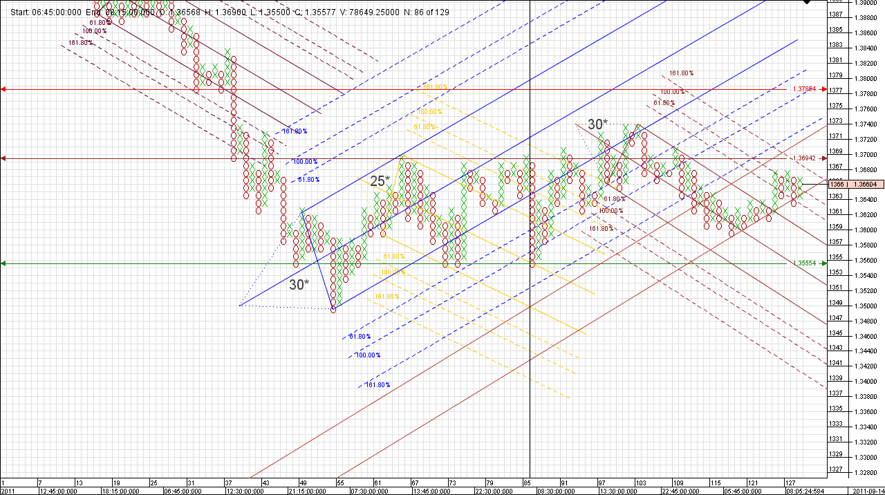
Currently Long...
-
PebbleTrader
- rank: 1000+ posts
- Posts: 1633
- Joined: Fri Nov 12, 2010 2:15 am
- Reputation: 15
- Gender:
Nice channel.
There is some interesting ideas on channels / trends in the definitive guide to PnF. That's the section I'm on at the moment, still "chewing on it all".
Then, onward to find software that will draw the PnF, cause I don't intend to do them manually ("But you can't feel the emotions!?")
I just wanted to learn how to do them manually so I could check all these faulty indi's (I don't trust anything!)
The only other reason I could think of for doing them manually is if you wanted to create a LARGE PnF that you could pin to your wall and let it grow, but that could still be accomplished by just printing off the computer generated ones.
I will say, I feel like a slightly better trader in doing the manual plotting exercises though.
Life is just a journey
-
PebbleTrader
- rank: 1000+ posts
- Posts: 1633
- Joined: Fri Nov 12, 2010 2:15 am
- Reputation: 15
- Gender:
http://i56.tinypic.com/2zz8dtv.jpg
So the colored columns where the column colors extend beyond the "X"s or "O"s is that "estimated adverse range expansion"? (There are just colored boxes that extend beyond the usual PnF "X"s or "O"s)
So the colored columns where the column colors extend beyond the "X"s or "O"s is that "estimated adverse range expansion"? (There are just colored boxes that extend beyond the usual PnF "X"s or "O"s)
Life is just a journey
Please add www.kreslik.com to your ad blocker white list.
Thank you for your support.
Thank you for your support.