From Zerohedge.....
Nick Gogerty of Designing Better Futures has come up with another of his highly entertaining and educational videos, this time focusing on a longitudinal comparison of housing prices by geographic area compared to household income. Aside from the obvious inflation in prices during the bubble years, the video should make those in the administration think if another credit bubble is just what this economy needs. The only long-term solution for our economic crisis is not to repeat (continuously) the mistakes of the past, but to focus on improving per capita incomes by whatever micro or macro means available.
Until that occurs, every ensuing "rebound" will be simply yet another asset bubble, each with an increasingly shorter duration, until the mechanisms to reflate the bubble expire. However, if the bubble approach to economics is overturned there will be huge losses for Wall Street and a large percentage of the already decimated banker community will end up collecting unemployment benefits. And neither Larry Summers nor Obama's other closet advisors want that outcome. So you might as well prepare to see a sequel of this chart in 5 years, when the HHI is the same, but the house price amplitude is a multiple of the one exhibited here.
http://www.youtube.com/watch?v=nSH9KEF8 ... r_embedded
Never Lose Again
Moderator: moderators
-
razorboy

- rank: 500+ posts

- Posts: 627
- Joined: Tue Oct 21, 2008 2:06 am
- Reputation: 0
- Location: Toronto
- Gender:

- Contact:
Housing Bubble...............
Ya, I manufacture clear shoe boxes.....http://www.clear-shoe-boxes.com.............who would have thunk!
http://thejoshkerbelproject.com/
http://thejoshkerbelproject.com/
Please add www.kreslik.com to your ad blocker white list.
Thank you for your support.
Thank you for your support.
-
monolisa

- rank: 150+ posts

- Posts: 351
- Joined: Fri Jun 12, 2009 11:38 am
- Reputation: 0
- Location: All Quiet on the Western Front
- Gender:
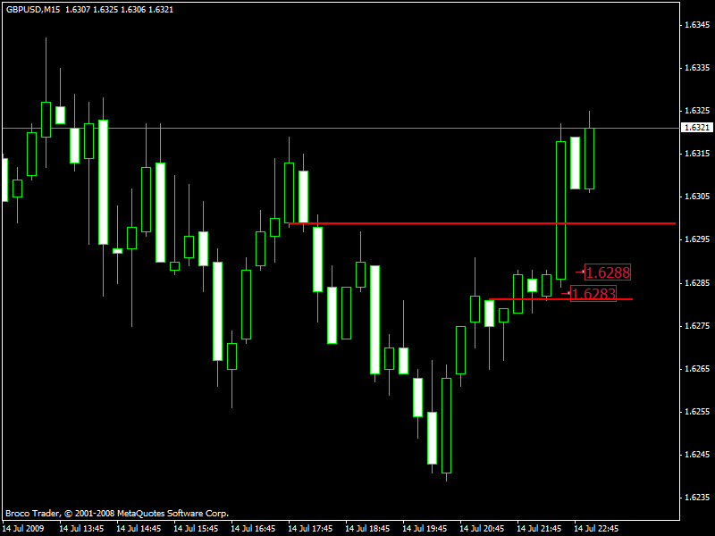
Good trade, pierre23. Pick the top of the correction spot on!!
I notice that when there's a high volume down bar in an uptrend it usually signal a change to downtrend. The weak up bars during the correction help entry.
Lis
I notice that when there's a high volume down bar in an uptrend it usually signal a change to downtrend. The weak up bars during the correction help entry.
Lis
"Know your enemy and know yourself, find naught in fear for 100 battles. Know yourself but not your enemy, find level of loss and victory. Know neither your enemy or yourself, wallow in defeat every time." - Sun Tzu
thanks Lis. I agree, spot on.
The first push to the downside was the clue that it may be a downtrend and when the correction didn't make a new high (before the first push down), with smaller up bars getting taken into consideration, I was waiting for that momentum back downward. Just gotta have patience.
Pierre
The first push to the downside was the clue that it may be a downtrend and when the correction didn't make a new high (before the first push down), with smaller up bars getting taken into consideration, I was waiting for that momentum back downward. Just gotta have patience.
Pierre
-
Fxtraveller
- rank: 150+ posts
- Posts: 395
- Joined: Thu Nov 27, 2008 2:56 pm
- Reputation: 6
- Location: UK
- Gender:

Please add www.kreslik.com to your ad blocker white list.
Thank you for your support.
Thank you for your support.
-
TheRumpledOne

- rank: 10000+ posts

- Posts: 15558
- Joined: Sun May 14, 2006 9:31 pm
- Reputation: 3035
- Location: Oregon
- Real name: Avery T. Horton, Jr.
- Gender:
- Contact:

Can you SEE why I like to laugh at the SQUIGGLYS?
I am NOT saying they don't work but if you look at the support/resistance dots you should be able to SEE what the SQUIGGLYS are telling you.
IT'S NOT WHAT YOU TRADE, IT'S HOW YOU TRADE IT!
Please do NOT PM me with trading or coding questions, post them in a thread.
Please do NOT PM me with trading or coding questions, post them in a thread.


Do you really need candle colour to determine direction?
I sometimes wonder if you are better off without it. A candle coloured up because its close is above the open, could in fact have a lower high and lower low than the previous candle.
I sometimes wonder if you are better off without it. A candle coloured up because its close is above the open, could in fact have a lower high and lower low than the previous candle.
Is price closing higher or lower than something? Simple yet powerful question. ..MO
-
monolisa
- rank: 150+ posts
- Posts: 351
- Joined: Fri Jun 12, 2009 11:38 am
- Reputation: 0
- Location: All Quiet on the Western Front
- Gender:
GBPUSD M3 Mightzone trade
Tick = Entry
Cross = Exit
Close to 100 pips in less than an hour. Thanks, MO.

Lis
Tick = Entry
Cross = Exit
Close to 100 pips in less than an hour. Thanks, MO.
Lis
"Know your enemy and know yourself, find naught in fear for 100 battles. Know yourself but not your enemy, find level of loss and victory. Know neither your enemy or yourself, wallow in defeat every time." - Sun Tzu
Please add www.kreslik.com to your ad blocker white list.
Thank you for your support.
Thank you for your support.