MightyOne wrote:I think I will leave and wait for the next red line:
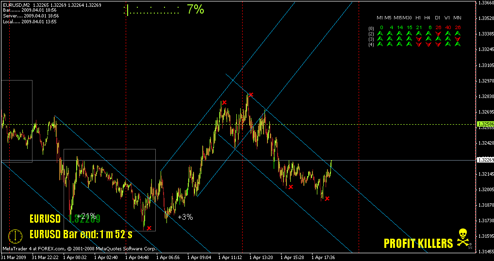
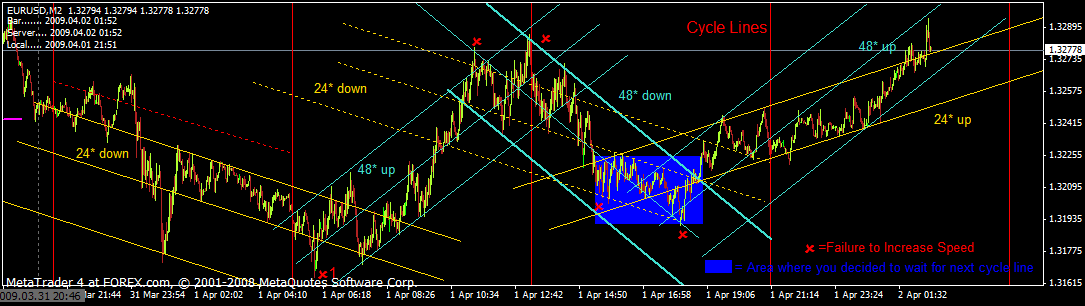
Red x's are failures to increase speed.
MO,
As I copy your angled channels onto my own charts I can really see the change in angles/speed. I can also see how the center of the channels act as support & resistance. It's pretty amazing. I have a few questions.
Your first red X (failure to increase speed, I've labeled mine as x1), why do you say this one is a failure? Isn't it a part of a move that takes us to the 48* channel?
In the center of the chart are 2 48* channels, down & up. In your chart you never drew the 24* down (yellow dotted lines) but I see that price does follow along this as well. Did you not draw the 24* channel because the 48* down was more prominent. When you have 2 channels of the same degree but different direction (up & down) is this the "V" pattern that has been eluded to by stationmichal?
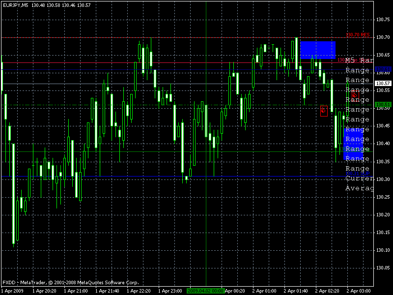
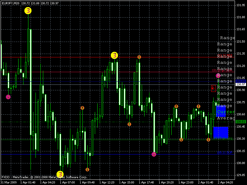
The blue box highlights where you decided to wait it out until the price hit the red line. This red line is the cycle line, right? How do you determine the cycle?
Do my channels beyond the blue box look correct? What is the predicted path since price has broken through the top of the 24* channel and is also running in a 48* channel?
I still haven't a clue about Weight, Hook and Net. Do you care to define this with more charts or an actual description of what happens in these areas labeled as such?
Thanks!!!
dee

[edit: OOPS, I see that my 2 initial down channels are not running parallel like your example! How do I ensure that I am drawing these correctly? My lines/channels seem to flow properly so is it really wrong?]